Tampilkan postingan dengan label case shiller. Tampilkan semua postingan
Selasa, 31 Januari 2012
S&P/Case-Shiller: November 2011
The latest release of the S&P/Case-Shiller (CSI) home price indices for November reported that the non-seasonally adjusted Composite-10 price index declined 1.29% since October while the Composite-20 index declined 1.27% over the same period with both measures continuing to decline notably since last year.
The latest CSI data clearly indicates that the price trends are experiencing a declining trend into the typically less active summer and fall season and as I recently pointed out, the more timely and less distorted Radar Logic RPX data is starting to capture notable falling prices driven primarily by seasonality.
The 10-city composite index declined 3.56% as compared to November 2010 while the 20-city composite declined 3.67% over the same period.
Topping the list of regional peak decliners was Las Vegas at -61.07%, Phoenix at -55.54%, Miami at -51.06%, Tampa at -47.36% and Detroit at -44.38%.
Additionally, both of the broad composite indices show significant peak declines slumping -32.87% for the 10-city national index and -32.94% for the 20-city national index on a peak comparison basis.
To better visualize today’s results use Blytic.com to view the full release.
The following charts (click for larger version) shows the percent change to single family home prices given by the Case-Shiller Indices as compared to each metros respective price peak set between 2005 and 2007 as well as annual and monthly changes.


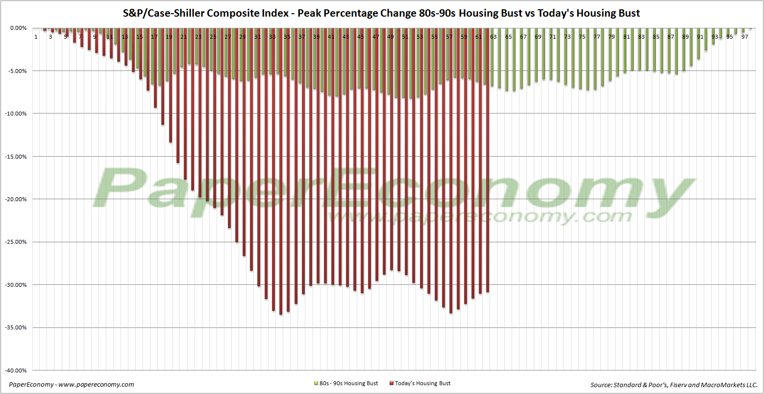
Additionally, in order to add some historical context to the perspective, I updated my “then and now” CSI charts that compare our current circumstances to the data seen during 90s housing decline.
To create the following annual and normalized charts I simply aligned the CSI data from the last month of positive year-over-year gains for both the current decline and the 90s housing bust and plotted the data side-by-side (click for larger version).


The “peak” chart compares the percentage change, comparing monthly CSI values to the peak value seen just prior to the first declining month all the way through the downturn and the full recovery of home prices.


Rabu, 28 Desember 2011
S&P/Case-Shiller: October 2011
The latest release of the S&P/Case-Shiller (CSI) home price indices for October reported that the non-seasonally adjusted Composite-10 price index declined 1.09% since September while the Composite-20 index declined 1.23% over the same period with both measures continuing to decline notably since last year.
The latest CSI data clearly indicates that the price trends are experiencing a declining trend into the typically less active summer and fall season and as I recently pointed out, the more timely and less distorted Radar Logic RPX data is starting to capture notable falling prices driven primarily by seasonality.
The 10-city composite index declined 3.02% as compared to October 2010 while the 20-city composite declined 3.40% over the same period.
Topping the list of regional peak decliners was Las Vegas at -60.66%, Phoenix at -55.79%, Miami at -50.80%, Tampa at -46.78% and Detroit at -44.12%.
Additionally, both of the broad composite indices show significant peak declines slumping -31.90% for the 10-city national index and -32.06% for the 20-city national index on a peak comparison basis.
To better visualize today’s results use Blytic.com to view the full release.
The following charts (click for larger version) shows the percent change to single family home prices given by the Case-Shiller Indices as compared to each metros respective price peak set between 2005 and 2007 as well as annual and monthly changes.


To create the following annual and normalized charts I simply aligned the CSI data from the last month of positive year-over-year gains for both the current decline and the 90s housing bust and plotted the data side-by-side (click for larger version).


Selasa, 29 November 2011
S&P/Case-Shiller: September 2011
Today’s release of the S&P/Case-Shiller (CSI) home price indices for September reported that the non-seasonally adjusted Composite-10 price index declined 0.42% since August while the Composite-20 index declined 0.64% over the same period with both measures continuing to decline notably since last year.
The latest CSI data clearly indicates that the price trends are experiencing a declining trend into the typically less active summer and fall season and as I recently pointed out, the more timely and less distorted Radar Logic RPX data is starting to capture notable falling prices driven primarily by seasonality.
The 10-city composite index declined 3.27% as compared to August 2010 while the 20-city composite declined 3.59% over the same period.
Topping the list of regional peak decliners was Las Vegas at -60.05%, Phoenix at -55.93%, Miami at -50.22%, Tampa at -46.50% and Detroit at -42.41%.
Additionally, both of the broad composite indices show significant peak declines slumping -31.18% for the 10-city national index and -31.26% for the 20-city national index on a peak comparison basis.
To better visualize today’s results use Blytic.com to view the full release.
The following charts (click for larger version) shows the percent change to single family home prices given by the Case-Shiller Indices as compared to each metros respective price peak set between 2005 and 2007 as well as annual and monthly changes.


To create the following annual and normalized charts I simply aligned the CSI data from the last month of positive year-over-year gains for both the current decline and the 90s housing bust and plotted the data side-by-side (click for larger version).


Selasa, 25 Oktober 2011
S&P/Case-Shiller: August 2011
Today’s release of the S&P/Case-Shiller (CSI) home price indices for August reported that the non-seasonally adjusted Composite-10 price index increased 0.24% since July while the Composite-20 index increased 0.15% over the same period with both measures continuing to decline notably since last year.
The latest CSI data clearly indicates that the price trends are experiencing a flattening into the typically less active summer and fall season and as I recently pointed out, the more timely and less distorted Radar Logic RPX data is starting to capture notable falling prices driven primarily by seasonality.
The 10-city composite index declined 3.49% as compared to August 2010 while the 20-city composite declined 3.80% over the same period.
Topping the list of regional peak decliners was Las Vegas at -59.46%, Phoenix at -55.84%, Miami at -49.83%, Tampa at -45.60% and Detroit at -42.22%.
Additionally, both of the broad composite indices show significant peak declines slumping -30.90% for the 10-city national index and -30.83% for the 20-city national index on a peak comparison basis.
To better visualize today’s results use Blytic.com to view the full release.
The following charts (click for larger version) shows the percent change to single family home prices given by the Case-Shiller Indices as compared to each metros respective price peak set between 2005 and 2007 as well as annual and monthly changes.


To create the following annual and normalized charts I simply aligned the CSI data from the last month of positive year-over-year gains for both the current decline and the 90s housing bust and plotted the data side-by-side (click for larger version).


Senin, 24 Oktober 2011
More Pain, Less Gain: S&P/Case-Shiller Preview for August 2011
 As I demonstrated in prior posts, given their strong correlation, the home price indices provided daily by Radar Logic, averaged monthly, can effectively be used as a preview of the monthly S&P/Case-Shiller home price indices.
The current Radar Logic 25 MSA Composite data reported on residential real estate transactions (condos, multi and single family homes) that settled as late as August 22 and averaged for the month indicates that with the slowing summer transactions has come a flattening of prices (the typical trend) with the national index declining 0.60% since July and falling 4.50% below the level seen in August 2010.
The Radar Logic index will likely be capturing an decline in prices from now until early 2012 as transactions continue to trend down.
Look for tomorrow's S&P/Case-Shiller home price report to reflect this flattening/declining trend though to a lesser degree due to its three month rolling-average nature with prices moderately higher.
Selasa, 27 September 2011
S&P/Case-Shiller: July 2011
Today’s release of the S&P/Case-Shiller (CSI) home price indices for July reported that the non-seasonally adjusted Composite-10 price index increased 0.88% since June while the Composite-20 index increased 0.91% over the same period with both measures continuing to decline notably since last year.
The latest CSI data clearly indicates that the price trends are experiencing a bit of a lift into the typically more active spring and early summer season but, as I recently pointed out, the more timely and less distorted Radar Logic RPX data is starting to capture falling prices driven primarily by seasonality.
The 10-city composite index declined 3.70% as compared to July 2010 while the 20-city composite declined 4.11% over the same period.
Topping the list of regional peak decliners was Las Vegas at -59.33%, Phoenix at -55.79%, Miami at -49.75%, Tampa at -45.56% and Detroit at -43.30%.
Additionally, both of the broad composite indices show significant peak declines slumping -30.96% for the 10-city national index and -30.87% for the 20-city national index on a peak comparison basis.
To better visualize today’s results use Blytic.com to view the full release.
The following charts (click for larger version) shows the percent change to single family home prices given by the Case-Shiller Indices as compared to each metros respective price peak set between 2005 and 2007 as well as annual and monthly changes.


To create the following annual and normalized charts I simply aligned the CSI data from the last month of positive year-over-year gains for both the current decline and the 90s housing bust and plotted the data side-by-side (click for larger version).


Rabu, 14 September 2011
Conspicuous Correlation: Retail Sales August 2011
Nominal discretionary retail sales including home furnishings, home garden and building materials, consumer electronics and department store sales increased 0.33% from July and increased 3.28% above the level seen in August 2010 while, adjusting for inflation, “real” discretionary retail sales declined 0.09% over the same period.
The following chart shows the year-over-year change to nominal discretionary retail sales and the year-over-year change to nominal the S&P/Case-Shiller Composite home price index since 1993 and since 2000.
Looking at the chart below (click for full-screen dynamic version), adjusted for inflation (CPI for retail sales, CPI “less shelter” for S&P/Case-Shiller Composite) the “rough correlation” between the year-over-year change to the “discretionary” retail sales series and the year-over-year S&P/Case-Shiller Composite series seems now even more significant.
Selasa, 30 Agustus 2011
S&P/Case-Shiller: June 2011
Today’s release of the S&P/Case-Shiller (CSI) home price indices for June reported that the non-seasonally adjusted Composite-10 price index increased 1.05% since May while the Composite-20 index increased 1.11% over the same period with both measures continuing to decline notably since last year.
The latest CSI data clearly indicates that the price trends are experiencing a bit of a lift into the typically more active spring season and, as I recently pointed out, the more timely and less distorted Radar Logic RPX data is continuing to capture rising prices driven primarily by seasonality.
It's important to note though that both composite indices are continuing to show notable year-over-year declines, a weak sign indeed.
The 10-city composite index declined 3.84% as compared to June 2010 while the 20-city composite declined 4.52% over the same period.
Topping the list of regional peak decliners was Las Vegas at -59.25%, Phoenix at -55.73%, Miami at -50.35%, Detroit at -48.51% and Tampa at -45.86%.
Additionally, both of the broad composite indices show significant peak declines slumping -31.56% for the 10-city national index and -31.58% for the 20-city national index on a peak comparison basis.
To better visualize today’s results use Blytic.com to view the full release.
The following chart (click for larger version) shows the percent change to single family home prices given by the Case-Shiller Indices as compared to each metros respective price peak set between 2005 and 2007.
 The following chart (click for larger version) shows the percent change to single family home prices given by the Case-Shiller Indices as on a year-over-year basis.
 The following chart (click for larger version) shows the percent change to single family home prices given by the Case-Shiller Indices as on a month-to-month basis.
 Additionally, in order to add some historical context to the perspective, I updated my “then and now” CSI charts that compare our current circumstances to the data seen during 90s housing decline.
To create the following annual and normalized charts I simply aligned the CSI data from the last month of positive year-over-year gains for both the current decline and the 90s housing bust and plotted the data side-by-side (click for larger version).

 The “peak” chart compares the percentage change, comparing monthly CSI values to the peak value seen just prior to the first declining month all the way through the downturn and the full recovery of home prices.

Langganan:
Postingan
(
Atom
)